Data Visualisation with Seaborn#
In this chapter, we’ll learn how to create beautiful and informative visualisations using seaborn. Data visualisation is one of the most important skills in data analysis — a good chart can reveal patterns that are invisible in raw numbers.
Why Visualise Data?#
Consider this: you have a dataset with 10,000 rows of sales data. You could:
Scroll through thousands of numbers (tedious and ineffective)
Calculate summary statistics (helpful but limited)
Create a chart that shows the pattern instantly (this is what we want!)
Visualisations help you:
Explore your data to find patterns
Communicate findings to others
Identify outliers and anomalies
Compare groups or categories
Python Visualisation Libraries#
There are several libraries for data visualisation in Python:
Library |
Description |
|---|---|
Matplotlib |
The most versatile and customisable — but verbose |
Seaborn |
Built on matplotlib, easier for beginners, beautiful defaults |
Plotnine |
Library that is very close to R’s ggplot2 (probably not updated regularly) |
Lets-plot |
Another library that is very close to ggplot2 (it is maintained regularly) |
We’ll focus on seaborn because it’s easy to learn and produces publication-quality plots with minimal code. I would suggest you learn Matplotlib later at some point.
Setting Up#
Let’s import the libraries we need:
import pandas as pd
import matplotlib.pyplot as plt
import seaborn as sns

# Apply seaborn's default theme for nicer-looking plots
sns.set_theme()
Note
We import matplotlib as plt because seaborn is built on top of it. We’ll use plt.show() to display our plots.
Loading Example Data#
Seaborn comes with several built-in datasets that are perfect for learning. Let’s load the famous “tips” dataset:
df_tips = sns.load_dataset('tips')
df_tips.head()
| total_bill | tip | sex | smoker | day | time | size | |
|---|---|---|---|---|---|---|---|
| 0 | 16.99 | 1.01 | Female | No | Sun | Dinner | 2 |
| 1 | 10.34 | 1.66 | Male | No | Sun | Dinner | 3 |
| 2 | 21.01 | 3.50 | Male | No | Sun | Dinner | 3 |
| 3 | 23.68 | 3.31 | Male | No | Sun | Dinner | 2 |
| 4 | 24.59 | 3.61 | Female | No | Sun | Dinner | 4 |
This dataset contains information about restaurant bills and tips. Let’s explore it:
df_tips.describe()
| total_bill | tip | size | |
|---|---|---|---|
| count | 244.000000 | 244.000000 | 244.000000 |
| mean | 19.785943 | 2.998279 | 2.569672 |
| std | 8.902412 | 1.383638 | 0.951100 |
| min | 3.070000 | 1.000000 | 1.000000 |
| 25% | 13.347500 | 2.000000 | 2.000000 |
| 50% | 17.795000 | 2.900000 | 2.000000 |
| 75% | 24.127500 | 3.562500 | 3.000000 |
| max | 50.810000 | 10.000000 | 6.000000 |
Scatter Plots#
A scatter plot shows the relationship between two numerical variables. Each point represents one observation.
Basic Scatter Plot#
Let’s see if there’s a relationship between the total bill and the tip:
sns.scatterplot(data=df_tips, x=df_tips['total_bill'], y=df_tips['tip'])
plt.show()
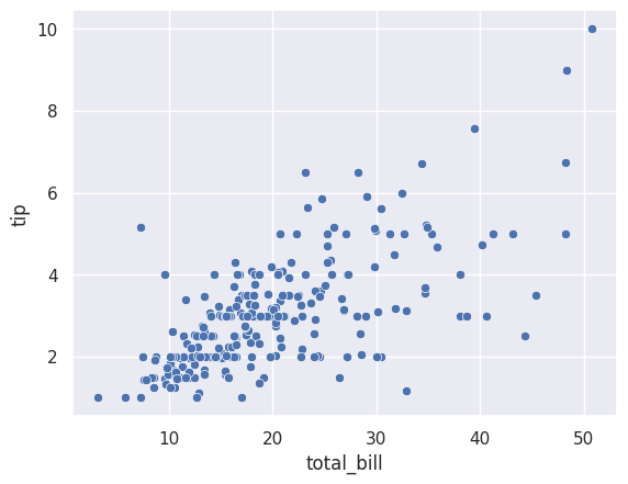
Notice the syntax:
data=df_tips— the DataFrame to usex=df_tips['total_bill']— the column for the x-axisy=df_tips['tip']— the column for the y-axis
The plot shows a positive relationship: higher bills tend to have higher tips. This makes intuitive sense!
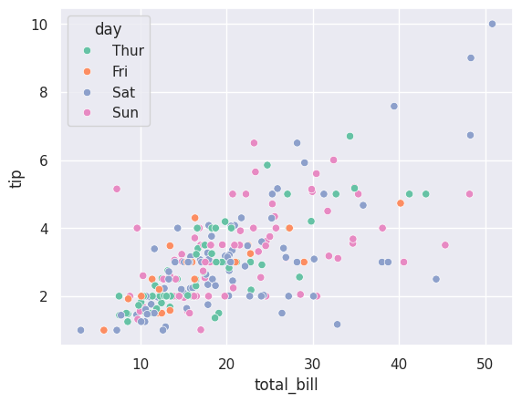
Adding Colour (Hue)#
We can add a third variable using colour. Let’s see if the pattern differs by gender:
sns.scatterplot(data=df_tips, x=df_tips['total_bill'], y=df_tips['tip'], hue=df_tips['sex'])
plt.show()
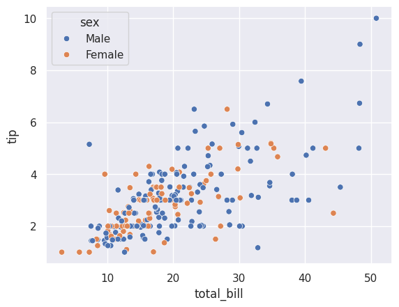
The hue parameter colours the points by the ‘sex’ column. Seaborn automatically:
Assigns different colours to each category
Adds a legend
Now we can compare the tipping patterns of male and female customers at a glance.
Tip
The hue parameter works with most seaborn plots. It’s a powerful way to add a categorical dimension to your visualisation.
Histograms#
A histogram shows the distribution of a single numerical variable. It divides the data into bins and counts how many values fall into each bin.
Basic Histogram#
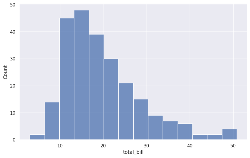
Let’s see how total bills are distributed:
sns.histplot(data=df_tips, x=df_tips['total_bill'])
plt.show()
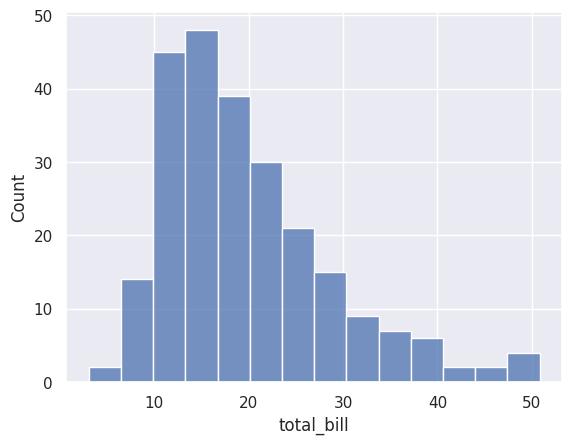
Most bills are between \(10 and \)25, with fewer very low or very high bills.
Adjusting the Number of Bins#
The bins parameter controls how many bars the histogram has:
sns.histplot(data=df_tips, x=df_tips['total_bill'], bins=40)
plt.show()
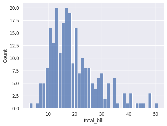
More bins show more detail, but can look noisy. Fewer bins show the overall shape but hide detail. Experiment to find the right balance.
Different Statistics#
By default, histograms show counts. You can change this with the stat parameter:
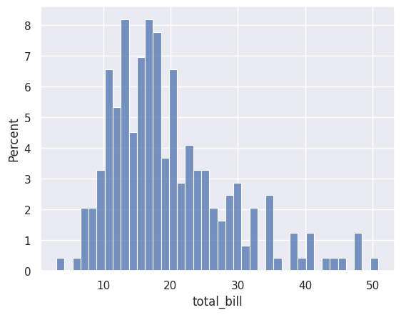
# Show percentages instead of counts
sns.histplot(data=df_tips, x=df_tips['total_bill'], bins=40, stat='percent')
plt.show()
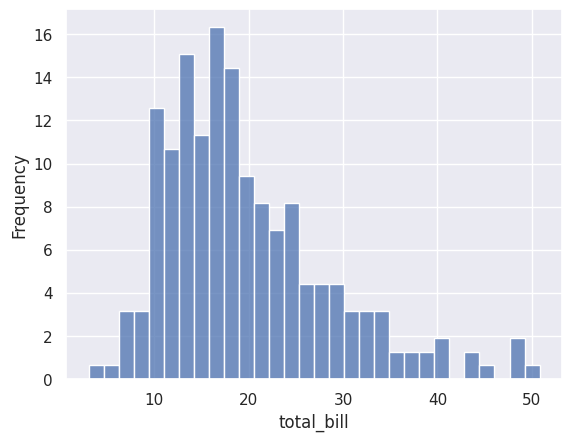
# Show frequency (same as count)
sns.histplot(data=df_tips, x=df_tips['total_bill'], bins=30, stat='frequency')
plt.show()
# Show density (area under curve = 1)
sns.histplot(data=df_tips, x=df_tips['total_bill'], bins=30, stat='density')
plt.show()
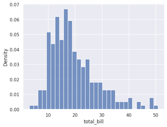
Stat |
Description |
|---|---|
|
Number of observations in each bin (default) |
|
Same as count |
|
Percentage of total observations |
|
Normalised so the area equals 1 |
Adding a Density Curve (KDE)#
You can overlay a smooth density curve using kde=True:
sns.histplot(data=df_tips, x=df_tips['total_bill'], kde=True)
plt.show()
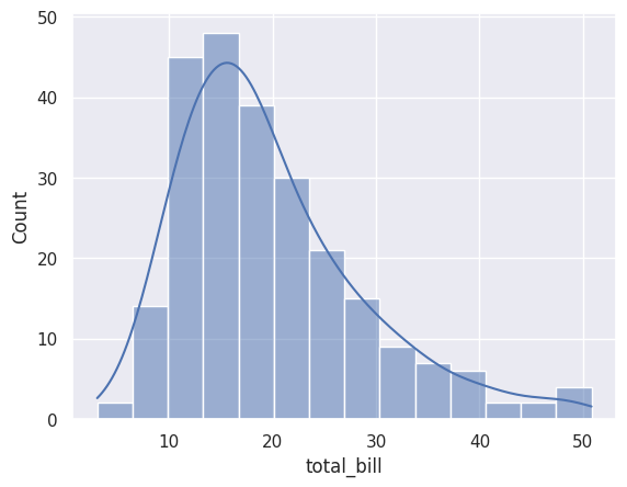
The KDE (Kernel Density Estimate) curve shows a smoothed version of the distribution.
Count Plots#
So far we’ve been visualising numerical variables (like total bill amounts). But what if you have a categorical variable — like the day of the week or a customer’s gender — and you simply want to know: how many observations are in each category?
That’s where countplot comes in.
Basic Count Plot#
Let’s see how many observations we have for each day:
sns.countplot(data=df_tips, x=df_tips['day'])
plt.show()
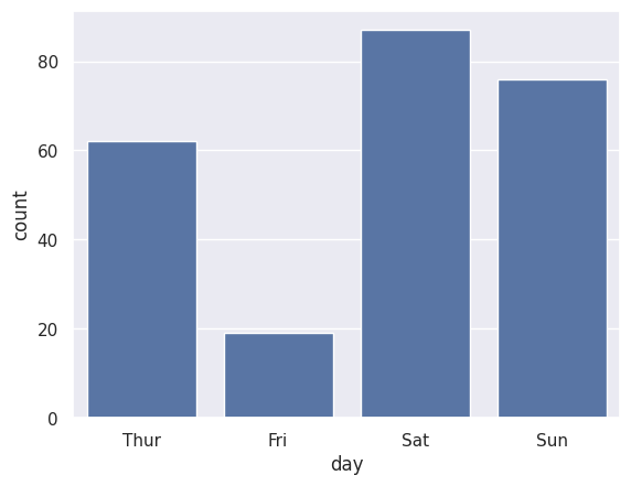
Notice that Saturday has the most observations in our dataset, while Friday has the fewest. The function automatically counts the rows for each category — you don’t need to calculate anything yourself.
Adding Colour with Hue#
What if we want to break each day down further — say, by gender? We can add the hue parameter:
sns.countplot(data=df_tips, x=df_tips['day'], hue=df_tips['sex'])
plt.title('Number of Visits by Day and Gender')
plt.show()
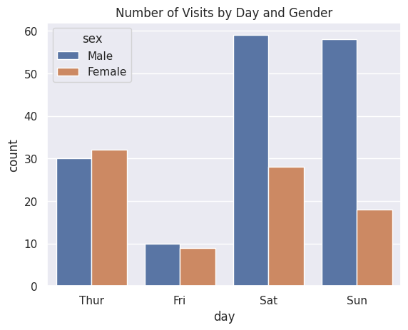
Now we can see how many male and female customers visited on each day. Notice how seaborn automatically creates a legend and uses distinct colours for each group.
Count Plot vs Bar Plot — What’s the Difference?#
This is a common point of confusion. Both look like bar charts, so when do you use which?
Plot |
What it shows |
When to use it |
|---|---|---|
|
How many observations in each category |
“How many smokers vs nonsmokers?” |
|
The mean of a numerical variable per category |
“What’s the average tip for each day?” |
Tip
Think of it this way: countplot counts rows, barplot summarises a column. If you’re counting, use countplot. If you’re averaging (or summing), use barplot.
Bar Plots#
A bar plot shows the relationship between a categorical variable and a numerical variable. By default, it shows the mean of the numerical variable for each category.
Basic Bar Plot#
Let’s compare average total bills for lunch vs dinner:
sns.barplot(data=df_tips, x=df_tips['time'], y=df_tips['total_bill'])
plt.show()
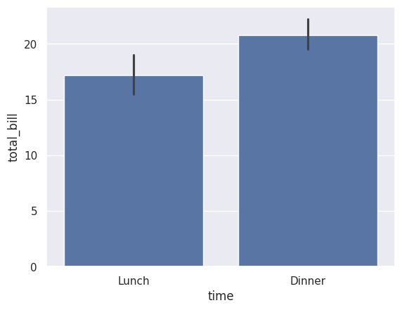
Dinner bills are higher on average than lunch bills.
Grouped Bar Plot#
Add hue to compare across another category:
sns.barplot(data=df_tips, x=df_tips['time'], y=df_tips['total_bill'], hue=df_tips['sex'], errorbar=None)
plt.show()
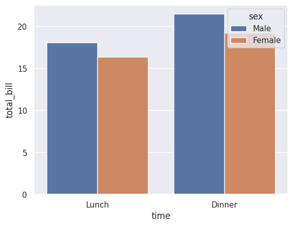
Now we can see that male customers have slightly higher bills on average, for both lunch and dinner.
Note
The errorbar=None removes the error bars. By default, seaborn shows 95% confidence intervals, which can be useful but also cluttered.
Box Plots#
A box plot (or box-and-whisker plot) shows the distribution of a numerical variable. It displays:
The median (middle line)
The interquartile range or IQR (the box — middle 50% of data)
Whiskers extending to 1.5 × IQR
Outliers as individual points beyond the whiskers
Basic Box Plot#
sns.boxplot(data=df_tips, x=df_tips['total_bill'])
plt.show()
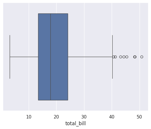
This shows the distribution of total bills. The box shows that 50% of bills are roughly between \(13 and \)24, with a few high outliers.
Comparing Groups#
Box plots are excellent for comparing distributions across categories:
sns.boxplot(data=df_tips, x=df_tips['total_bill'], y=df_tips['sex'])
plt.show()
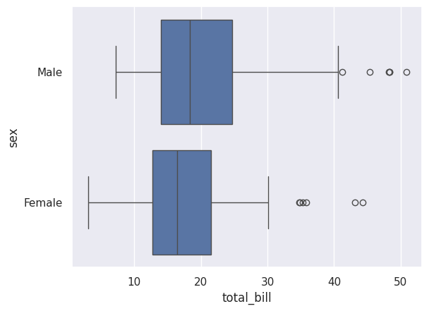
This shows the distribution of total bills separately for males and females. We can see that:
Male customers have a slightly higher median bill
Both groups have outliers at the high end
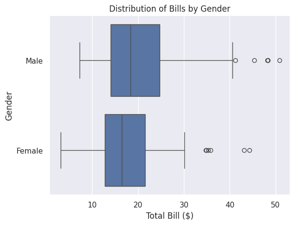
Adding a Title and Labels#
You can customise the plot using the .set() method:
sns.boxplot(data=df_tips, x=df_tips['total_bill'], y=df_tips['sex']).set(
    title='Distribution of Bills by Gender',
    xlabel='Total Bill ($)',
    ylabel='Gender'
)
plt.show()
Line Plots#
A line plot shows how a numerical variable changes over time or another ordered variable. It’s particularly useful for time series data.
Loading Time Series Data#
Let’s use the flights dataset, which shows monthly airline passenger numbers:
df_flights = sns.load_dataset('flights')
df_flights.head()
| year | month | passengers | |
|---|---|---|---|
| 0 | 1949 | Jan | 112 |
| 1 | 1949 | Feb | 118 |
| 2 | 1949 | Mar | 132 |
| 3 | 1949 | Apr | 129 |
| 4 | 1949 | May | 121 |
Basic Line Plot#
sns.lineplot(data=df_flights, x='year', y='passengers', errorbar=None)
plt.show()
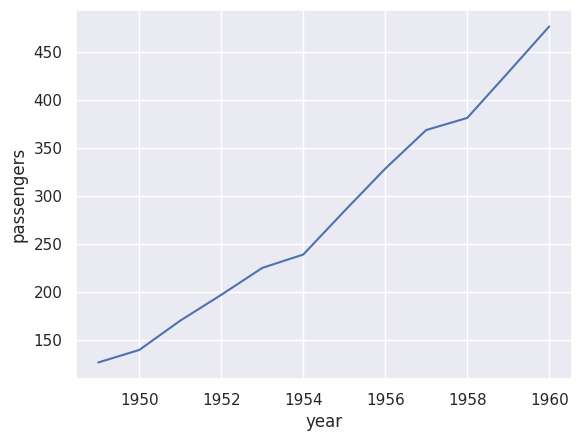
This shows the average number of passengers per year. The clear upward trend shows that air travel grew significantly from 1949 to 1960.
Multiple Lines#
Use hue to show separate lines for each category:
sns.lineplot(data=df_flights, x='year', y='passengers', hue='month')
plt.show()
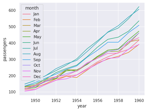
Now we can see the trend for each month. Notice that:
All months show an upward trend
Summer months (especially July and August) consistently have more passengers
The seasonal pattern is clear
Faceted Plots with displot#
Sometimes you want to create separate plots for different categories. The displot function (distribution plot) makes this easy:
sns.displot(data=df_tips, x='total_bill', col='time', kde=True)
plt.show()
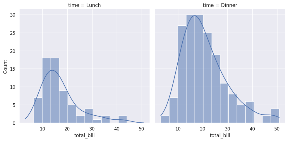
This creates two histograms side by side — one for Lunch and one for Dinner. The col='time' parameter creates a separate column for each value of ‘time’.
Choosing the Right Chart#
Here’s a quick guide to choosing the right visualisation:
Data Type |
Question |
Chart Type |
|---|---|---|
1 numerical |
What’s the distribution? |
Histogram, Box plot |
2 numerical |
What’s the relationship? |
Scatter plot |
1 categorical + 1 numerical |
How do groups compare? |
Bar plot, Box plot |
Time series |
How does it change over time? |
Line plot |
1 categorical |
What are the frequencies? |
Count plot (bar chart) |
Saving Your Plots#
To save a plot as an image file, use matplotlib’s savefig:
sns.histplot(data=df_tips, x=df_tips['total_bill'], bins=30)
plt.savefig('my_histogram.png')
plt.show()
You can save in various formats: .png, .jpg, .pdf, .svg.
Tip
Call plt.savefig() before plt.show(). Once show() is called, the figure is cleared.
Common Customisations#
Changing Figure Size#
plt.figure(figsize=(10, 6))  # Width, Height in inches
sns.histplot(data=df_tips, x=df_tips['total_bill'])
plt.show()
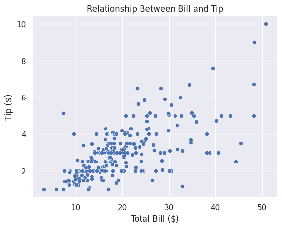
Adding Titles and Labels#
sns.scatterplot(data=df_tips, x=df_tips['total_bill'], y=df_tips['tip'])
plt.title('Relationship Between Bill and Tip')
plt.xlabel('Total Bill ($)')
plt.ylabel('Tip ($)')
plt.show()
Changing Colours#
Seaborn has many built-in colour palettes:
sns.scatterplot(data=df_tips, x=df_tips['total_bill'], y=df_tips['tip'], hue=df_tips['day'], palette='Set2')
plt.show()
Popular palettes include: 'Set1', 'Set2', 'deep', 'muted', 'pastel', 'bright'.
Exercises#
Exercise 16
Exercise 1: Create a Scatter Plot
Using the tips dataset:
Create a scatter plot with
total_billon the x-axis andtipon the y-axisColour the points by the
daycolumnAdd a title: “Tips by Total Bill and Day”
Solution to Exercise 16
import seaborn as sns
import matplotlib.pyplot as plt

df_tips = sns.load_dataset('tips')

sns.scatterplot(data=df_tips, x=df_tips['total_bill'], y=df_tips['tip'], hue=df_tips['day'])
plt.title('Tips by Total Bill and Day')
plt.show()
Exercise 17
Exercise 2: Create Histograms
Using the tips dataset:
Create a histogram of the
tipcolumnUse 20 bins
Add a KDE curve
Change the stat to show percentages
Solution to Exercise 17
import seaborn as sns
import matplotlib.pyplot as plt

df_tips = sns.load_dataset('tips')

sns.histplot(data=df_tips, x=df_tips['tip'], bins=20, kde=True, stat='percent')
plt.title('Distribution of Tips')
plt.xlabel('Tip ($)')
plt.show()
Exercise 18
Exercise 3: Compare Distributions
Using the tips dataset:
Create a box plot comparing
total_billacross different days (daycolumn)Add appropriate title and labels
What day has the highest median bill?
Solution to Exercise 18
import seaborn as sns
import matplotlib.pyplot as plt

df_tips = sns.load_dataset('tips')

sns.boxplot(data=df_tips, x=df_tips['day'], y=df_tips['total_bill'])
plt.title('Total Bill Distribution by Day')
plt.xlabel('Day of Week')
plt.ylabel('Total Bill ($)')
plt.show()

# Answer: Sunday has the highest median bill
Exercise 19
Exercise 4: Complete Visualisation
Load the ‘penguins’ dataset from seaborn:
penguins = sns.load_dataset('penguins')
Create the following visualisations:
A scatter plot of
flipper_length_mmvsbody_mass_g, coloured byspeciesA histogram of
bill_length_mmwith separate colours for each speciesA box plot comparing
body_mass_gacross species
What patterns do you notice?
Solution to Exercise 19
import seaborn as sns
import matplotlib.pyplot as plt

penguins = sns.load_dataset('penguins')

# 1. Scatter plot
plt.figure(figsize=(10, 6))
sns.scatterplot(data=penguins, x=penguins['flipper_length_mm'], y=penguins['body_mass_g'], hue=penguins['species'])
plt.title('Penguin Size by Species')
plt.xlabel('Flipper Length (mm)')
plt.ylabel('Body Mass (g)')
plt.show()

# 2. Histogram
plt.figure(figsize=(10, 6))
sns.histplot(data=penguins, x=penguins['bill_length_mm'], hue=penguins['species'], bins=20)
plt.title('Bill Length Distribution by Species')
plt.xlabel('Bill Length (mm)')
plt.show()

# 3. Box plot
plt.figure(figsize=(10, 6))
sns.boxplot(data=penguins, x=penguins['species'], y=penguins['body_mass_g'])
plt.title('Body Mass by Species')
plt.xlabel('Species')
plt.ylabel('Body Mass (g)')
plt.show()

# Patterns:
# - Gentoo penguins are the largest (highest body mass)
# - Adelie penguins have shorter bills
# - There's a clear relationship between flipper length and body mass
# - The three species form distinct clusters in the scatter plot